
The ongoing discussion of Buck’s design of the Alegria Styleguide for Facebook is often framed as a softening of big tech for a mass audience.
And to be sure, the images of post racial anybodies, tiny blue heads and giant arcs of limbs engaged in “joyful” activity has the pleasant promise of an undedicated greeting card. Its the illustrative equivalent of Muzak, the visual equivalent of elevator music – everywhere and nowhere at once.
Except I keep seeing this style, (and it is consciously reductive and particularly stylized), taken up by not only the “tech world” in general, but by student designers who see this as a trend that possibly provides an easy pathway to employment, in direct proportion to its further visual homogenization. This preemptive capitulation to the imaginative template of corporate image making is a pervasive fear of difference as productive, and of creativity as a process.
At a discipline level, the idea of “motion design” as a simplified animated commodity, a kind of page as stage without depth or detail is same absence of creative discrimination that propelled “infographics” into the bargain basement realm of the explainer video.
And again, not to say this work is somehow unworthy in toto – but there is a lack of critical distance in so many designers, an unthinking embrace of a templated style as yardstick for creative activity.
The embrace of this now ubiquitous style serves two particular interests.
By style-guiding animation, and rendering it procedurally simple and stylistically reductive, there is minimal friction in the production process. Animators and Illustrators, removed from the troublesome tasks of thinking through their work, can simply produce more in a given time.
This emphasis on operational efficiency is creative consumerism – a capitulation to Taylorism, in which the logic of production and standardization defines all activity.
It’s enemy is genuine creativity and the associated uncertainty. There is no dialectic at play – just a menu to pick from.
This vision of work as a platform underpins so much of the tech mindset that it’s difficult to disassemble it’s reductive claims to creativity and human potential from what these terms might actually mean.
In a more sinister sense, the sweeping happy sameness of these images consciously erases not only difference, but represents the individual as an interchangeable sign, a module – abstracted, flat and immersed in their perpetual enthusiasm. This world erases all texture, difference in space, even time itself in an endless present without cause or effect.
Human society is rendered uncomplicated and safe- without the potential for complex representation or activity.
The subject is reduced to a distant cypher – the figure represents nothing more than an existence whose dimensions are totally prefigured. The figure sits, walks, rides a bicycle, holds aloft a company icon like a Puja Procession and enjoys the unquestioned benefits of a life interwoven with technology, which in turn is no more than an enhancing ornament to this flat world’s idyll.
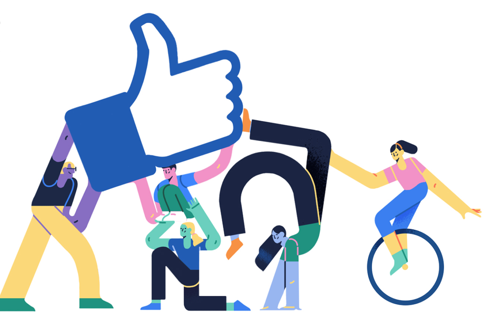
Buck Alegria (Joy) style developed for Facebook
Yet even in the Puja Procession, the idol is an object for spiritual contemplation, a complex and interwoven series of traditions and ceremonies laced with regional difference and interpretation.
The like button is the opposite – the reduction of human articulation to a simple global indexic grunt of approval. Pre approved by the “User Experience” team.
Tech’s representation of humanity the uncomplicated every person of Peanuts, stripped of character, meaningful difference or wider social analogy and critique.
What this imposes, with a silent menace (effaced by the restless pseudo-optimism of its presentation), is the erasure of the perceiving Cartesian subject, the locus of Western philosophy since the enlightenment. To see the world, to know with the mind and to discriminate with the senses is now no longer important – because this new codified world without telos, this endless horizontal present, is a safe place to scroll and press like.
Because the pictures say so.
Underneath this strategy, is a cynical reduction of human experience and imagination, which is entirely in line with the program of these technology platforms.
The subject in this predetermined set of relations does not “see” the platform, rather the platform sees the subject. Under the regime of surveillance these “tools” mask as communities, connections and lived lives.
For Facebook, human experience is only obliquely gathered as a datapoint, of observable impulses and connections – correlated “likes” – aggregated as pure quanta, and connected to enhance their commercial value.

Hinge, (Dating app) Illustration
Design is the considered and discriminating reduction of an idea, through process, to arrive at an optimal solution, to meet a desired outcome. It’s intentional, which is how it uses process, ideas and observation – the intention to design is clear at every stage of the process.
In the flat world of this reductive “Illustration” and low input animation, we can only see the intentional production of this particular worldview as a willing evasion of complexity.
Simplicity can be elegant, poetic, thoughtful, and calming. And yet simplicity is a quality, whereas simplification is an intentional process.
The endemic simplification of this flat and unproblematic world instead feels like the relentless internalization of alienation as unproblematic, inevitable and more disturbingly, sufficient.